
I’d like to share with you some of my personal favorite places to look for data visualizations. First up is Reuters Graphics. Reuters Graphics has a ton of data visualizations relating to current events, and this updates probably about every week or so or more frequently.
For example, this is a great visualization on plastic. A plateful of plastic. Visualizing the amount of microplastic we eat pieces by Reuters Graphics are characterized by the sort of scroll aspect, where when you scroll through the piece. It sort of progresses in what it shows you.
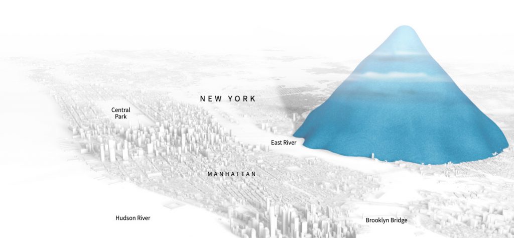
Here’s another piece by Reuters Graphics. Drowning in Plastic. As you scroll down it says alright there’s Christ the Redeemer, 38 metres and that’s how many million bottles are sold around the world, and every day relative to the Eiffel Tower, every month relative to the Eiffel Tower, and so on. Until we get to the past ten years, four trillion bottles. That would stack up like that relative to Manhattan. So there’s a lot of great stuff from Reuters Graphics.
Next up we’ve got The Upshot from the New York Times. The upshot has been putting out serious quantities of interactive data visualizations for years and years now. Here’s a selection of some of their work from 2015.
And then there’s The Pudding. A digital publication that explains ideas debated in culture with visual essays. The Pudding puts out a ton of great work. Here’s a selection of some of their pieces from 2019.
FiveThirtyEight also has a lot of great data visualizations. Here’s a taste of their work the 52 best and weirdest charts we made in 2016. They have a ton of content and they’ve got a very well-defined brand style. I really like their style and they release new stuff all the time.
And then there’s FlowingData. Flowing data is more of a blog that curates work produced by others found around the web. it’s updated pretty frequently so this is a great place to check in to from time to time there are more places like Reddit.
Data is Beautiful this is another continuously updated curated list of existing data visualizations and this is more of a crowd-sourced style, and then there’s the cantar Information is Beautiful awards. This is an annual awards ceremony where people submit their visualizations throughout the year and every year some winners are selected there are winners in different categories like unusual information design, humanitarian, politics, and global. And more the stuff you find in here is extremely aesthetically pleasing and highly curated.
Quartz also does a lot of great visualization work. Quartz puts out a lot of pieces about data visualization as well as featuring data visualization. For example, this is a classic piece from Quartz about satellites in orbit. You can hover over these dots, for example. the International Space Station.
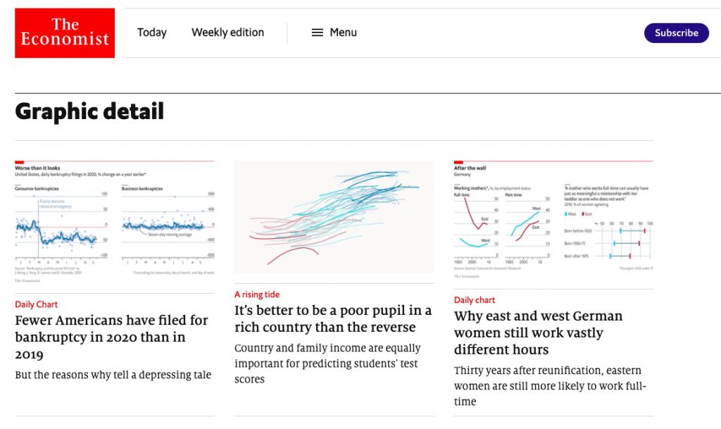
Graphic Detail from The Economist is another great place to look they have a daily chart section where they put out a visualization every day and they also do very detailed pieces for print around Christmas time they put out this amazing PDF a year in graphic detail that has a lot of their print visualizations like this awesome one about space launches. These visualizations are extremely information-dense and you need to spend a lot of time with each one in order to really read them properly but they’re very very well done.
Well worth studying and of course there’s hashtag #dataviz is on Twitter. This is kind of a zoo and there can be a lot of noise in here but I often like to just check #dataviz on Twitter because it’s a great place to find new releases or old stuff that’s being shared again after a long time.
When you’re working on data visualizations yourself with d3 there are a couple of places you can look for implementations including Blockbuilder. Blockbuilder search is a search engine for blocks org which is where a lot of d3 examples are hosted. If you don’t enter anything but then you click with thumbnail image it shows you the most recent pieces on blocks’ network and then you can search for example globe will show you a bunch of globes force will show you force-directed layouts or any technique like scatter plot will yield a bunch of examples you can then click through to any one of these to this link here that says block start work to see the running example inside of blocks to work, and if you scroll down you can see the code right there that you can use and draw from.
Observable is another great relatively new source for data visualization content. Observable has an explore section where you can see trending pieces, recently published pieces, most liked, last week, all-time, most liked and also catalogued by topic. For example in the visualization topic, it’s a collection of implementations for various techniques like this very cool example density contour matrix with brushing.