
I’m going to use some material from this textbook by Tamara Munzner – Visualization Analysis and Design. So the following slides, some of them are by Tamara Munzner.
According to Munzner, in this book…
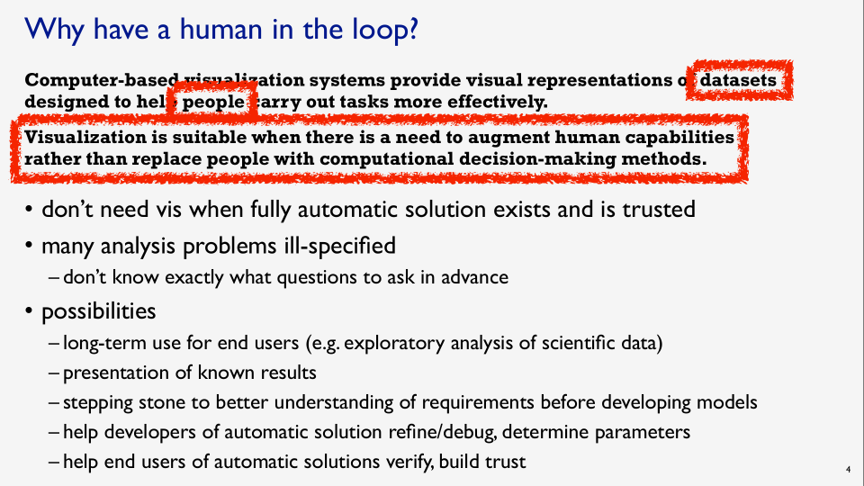
“Computer-based visualization systems provide visual representations of datasets designed to help people carry out tasks more effectively”
Tamara Munzner, Visualization Analysis and Design
More effectively than they would be able to without visual representations.
“Visualization is suitable when there is a need to augment human capabilities rather than replace people with computational decision-making methods.”
Tamara Munzner, Visualization Analysis and Design
It’s very human-oriented. So you don’t need visualization when you have a fully automatic solution for doing some tasks. Machine learning comes to mind. Machine learning solves a lot of problems that you don’t need a visualization for.
“Many analysis problems are ill-specified
Tamara Munzner, Visualization Analysis and Design
– don’t know exactly what questions to ask in advance.”
That’s one place where visualization is really useful.
Possibilities for visualization products
“long-term use for end-users”
For example, you build a tool that an organization is going to use for years to come.
“Presentation of known results”
As in coming up with a figure for a paper that you’re going to present, or a journal article that you’re writing, or a news article.
A “stepping stone to a better understanding of requirements before developing models
What she means there are computer-based models, like statistical models or machine learning models, before you get into developing those very specific things, visualization is a good stepping stone to just explore the data that you have on hand.
To “help developers of automatic solutions refine/debug those systems, “ and “help end-users of automatic solutions verify and build trust”
So this is Tamara Munzner’s take on why to visualize data. I want to emphasize that it’s very human-oriented. It’s to help people carry out tasks that they can carry out, enabled by data sets. Concrete data that’s on hand.
So why use an external representation?
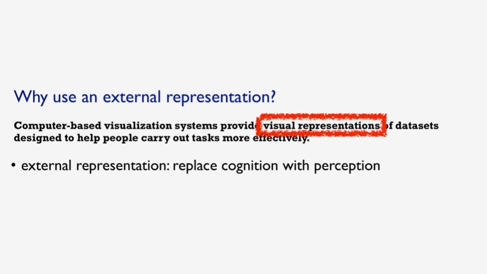
Tamara Munzner, Visualization Analysis and Design
“Computer-based visualization systems provide visual representations of datasets designed to help people carry out tasks more effectively. External representation: replace cognition with perception.”
Somebody asked Richard Feynman, the famous physicist how do you do your work? How do you come up with your amazing ideas? And he’s like, I think on paper and I don’t know if it’s word-for-word correct, but the person interviewing him said what do you mean you think on paper as you think of it and then you write it down? and he’s like no, no, no, no, no the thinking happens on the paper, my thought process has expanded outside of my head into a physical representation of the ideas. It’s that feedback loop between your head and this external representation that makes your cognition augmented.
So that I think is really the core of what visualization is about. It’s using computers and displays of graphics to augment what you could do without it – like with raw tables or just by writing things on paper, or mathematical models. So that’s why we use an external representation.
Example: Religions by Country
I want to give some examples to demonstrate this. So let’s say you want to know which country on earth has the most Hindus. Most people who adhere to the Hindu religion – and I found this interesting dataset from the PEW foundation about religion by country. And these are the top 20 most populous countries, so it’s a data table that has 161 rows. Each row is a unique combination of country and religion with the count for that combination. So you could read through each of these numbers and say – okay, in China, there are this many Christians and there are this many Muslims, this many Hindus. And you could read through the list and try to figure out which country has the most Hindus. And the point is, by looking at this table and trying to read each of these numbers, and remember what they were in your head, and then go back and consult your memory of what the other numbers are as you read through this, it’s a very cognitive intensive activity. It’s using a lot of your brainpower, but the point of visualisation is to offload that brainpower to your eyes, and your visual perception system. Because you can perceive so much with your eyes.
Dataviz: Stacked Bar Chart
So here’s a visualization of that data set it’s a stacked bar chart, where the religions are along the left, and the colors represent the different religions. Looking at it like this you can phrase the question: “Which country has the most Hindus” as a visual question. You can convert that from concepts to questions about shapes on the screen. So instead of asking what country has the most Hindus, you need to ask yourself, which Red Square is the biggest. And so by looking at this, you can you can see easily the biggest Red Square, and it’s in India. So that’s just a static visualisation.
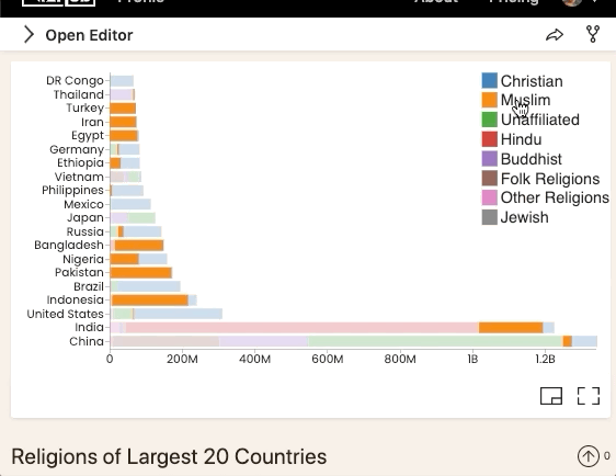
Adding interactivity
You can do so much more when you start adding interactivity, such as hovering over these entries in the color legend to see the highlighted corresponding colors in the graphic.
So this is a form of interaction that I feel is underutilized every time you have a visualization with a color legend. You could add this interaction, or the authors of the graphic could add this interaction, and it would make these tasks a lot quicker. Then you could say, okay I want to look at Hindus and hover over that, and it pops out very quickly. And so with that hovering interaction, you can see – “oh yeah India has the the most Hindus, but there are other countries in this top 20 list that do have a significant number of Hindus,” specifically Bangladesh.
Interaction Technique: Tooltips
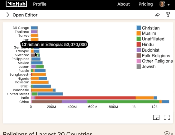
And then here’s another interaction technique called tooltips, where you hover over these rectangles, and you get more details on demand. This is also a technique of interaction that you could apply to pretty much any visualization by hovering, getting more information.
What I love about visualization is it lets you step back to, you can just without any questions in mind, you could just look at this, and ponder what it says. One thing that surprises me about this particular visualization is that some countries are very very much majority religion – as in most of the people are one religion in these countries. Like what pops out is Turkey, Iran, and Egypt, or you could say Muslim-majority Bangladesh, Pakistan, Indonesia. Nigeria is split down the middle between Muslim and Christian. I find that fascinating. And there are some Christian majority countries – Mexico, Philippines, United States. There’s a huge portion of unaffiliated in the United States. You could go on, and on, and on, and just look at this and interact with it, and ask new questions that you wouldn’t have thought about before without seeing the visualization. And that’s another powerful aspect of visualization. It brings up questions that you wouldn’t know to ask if you didn’t do the first step of visualizing the data.
There we have it. That’s what data visualization is, and why bother.