
In the second week of Datavis 2020 we had our first assignment:
Find visualizations relating to current events and share them.
Here are some of the visualizations shared.
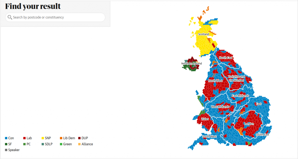
I have to say that this election map by The Guardian is a missed opportunity for interactive color legend!

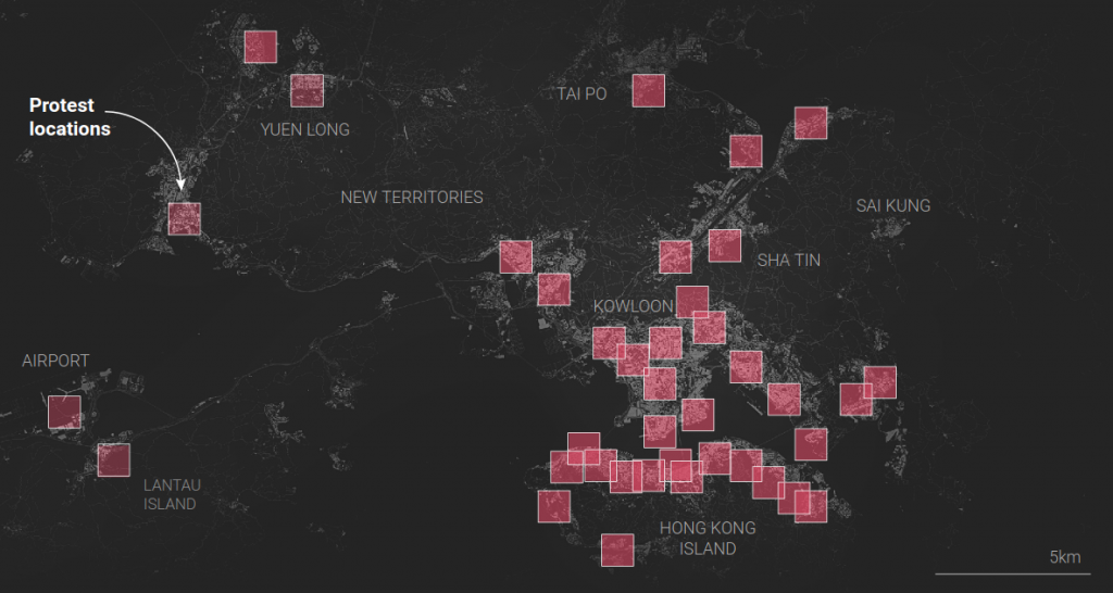
The long form investigative piece on Key events from Hong Kong’s anti-government protests by South China Morning Post is very impressive. I really appreciate how nearly the full story is told here, using visual summaries and also textual and photographic content for detailed accounts of each incident.

The piece Drowning in Plastic by Reuters Graphics is an excellent example of what’s called a Sankey Diagram. This type of visualization is great for showing flows.
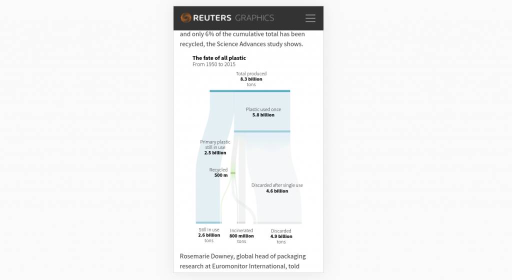
The piece employs a dedicated layout for mobile that makes the visualization flow vertically rather than horizontally. It often does make sense to devote resources to making visualizations look good on mobile, as so many readers come from mobile devices!
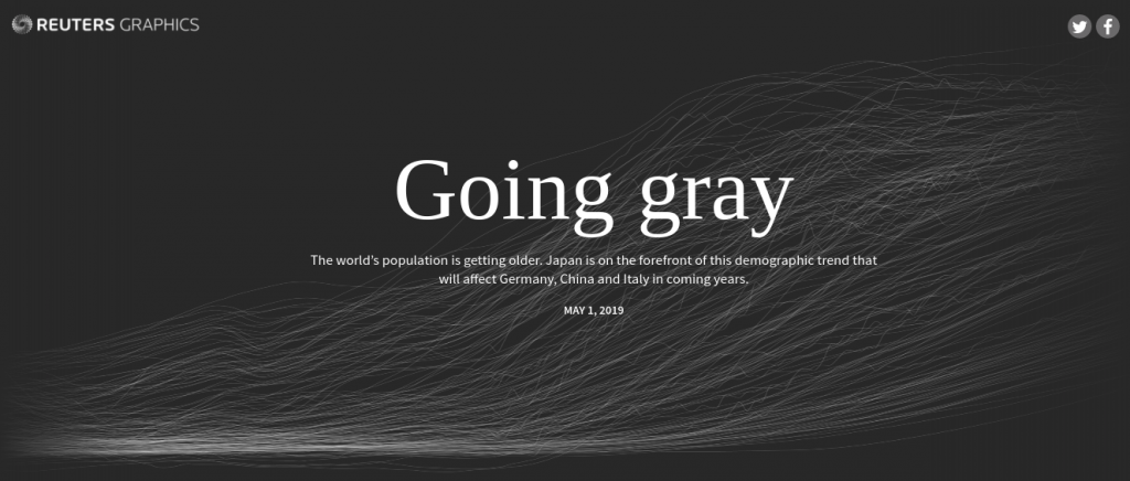
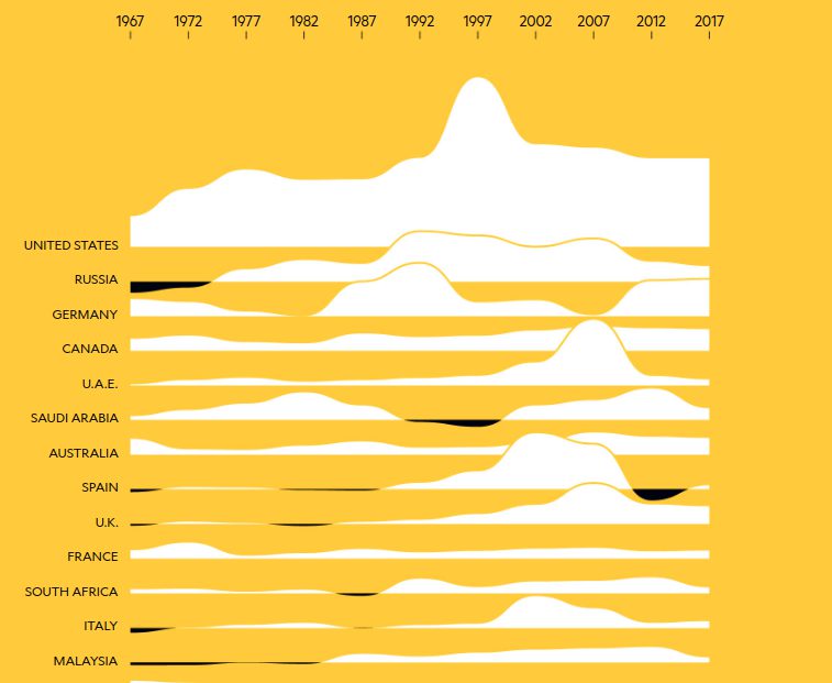
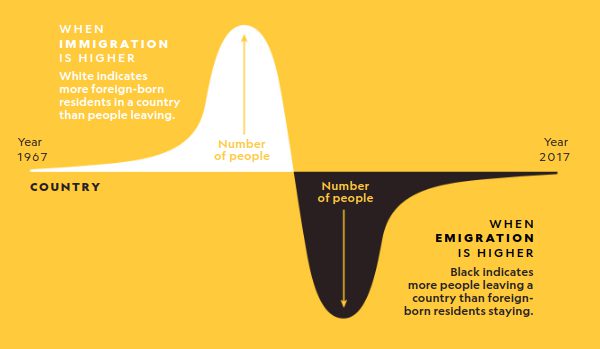
The piece Going Gray by Reuters Graphics uses the “Scrolytelling” technique. As you scroll, the visualization stays put and changes as text flies by.
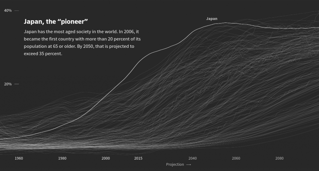
As you scroll, lines representing particular countries (like Japan for example) get highlighted as a text blurb about them scrolls by.


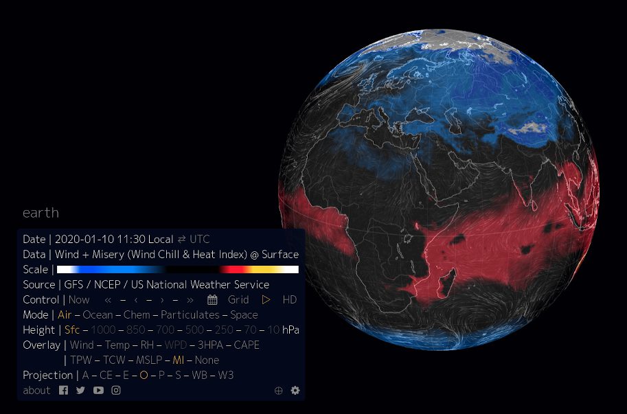
The project earth.nullschool.net by Cameron Beccario is one of the greatest visualization projects ever in my opinion. It shows live data about weather. It has a really nice control panel where you can select from wind, temperature, humidity, and even pollution metrics!
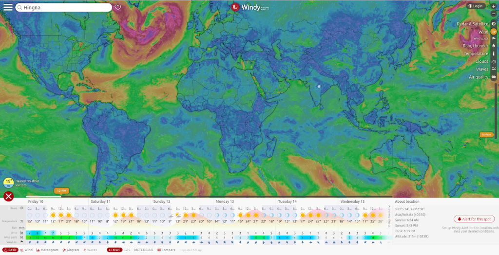
Windy is a similar tool.
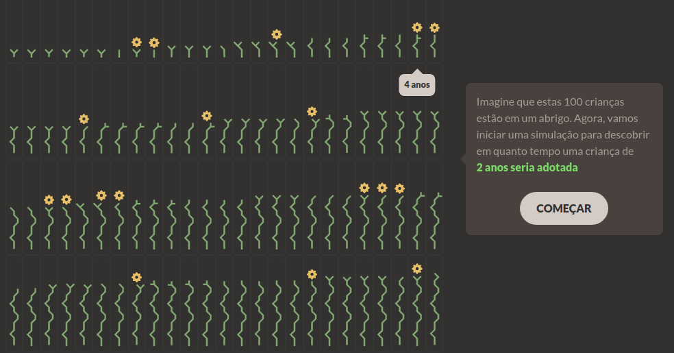
The piece Simulação mostra quais crianças são adotadas (e quais não são) no Brasil uses an interesting novel visualization technique. I have no idea what it’s about but it looks beautiful! In fact it’s a winner in the Kantar Information is Beautiful awards.

The piece “Flock’n Roll” explores interactive complex systems and flocking. While not exactly traditional data visualization, it has some really interesting aspects. There is a visual representation of the flocking model for an individual agent (right). Interactive sliders let you change parameters of the model in real time as it runs.
The point of this assignment was to show that data visualization is relevant to everyone. Data visualization is a technology – a tool – that can be applied to more deeply understand current affairs that are relevant to everyone’s daily lives.