
Posted Jan. 3 by Curran Kelleher
We’re off to a great start to the Datavis 2020 course!
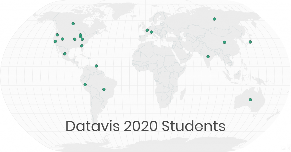
The launch video was posted just a few days ago on January 1, and so far there are over 50 enthusiastic students getting involved. So far there are students from the US (Oregon, Georgia, Chicago, Kansas City, Cincinnati, Wisconsin, Utah, California), India, France, Russia, Peru, Brazil, Canada, México, Australia, Switzerland, China, Japan, and even Trinidad and Tobago!
Q & A
Here’s a bit of Q & A from the first week, extracted from YouTube comment threads and our course Slack channel from
Q: What are the prerequisites? Do I need to know React?
A: The only prerequisites are:
- an Internet connection,
- a computer, and
- time to invest in learning.
It’s good to have knowledge of some programming language, and ideally some experience with HTML & JS, but I will try to include foundations as well and answer fundamental questions as they arise. For this course “There are no stupid questions”, and questions really help me to identify gaps in knowledge and craft the material. No need to already know React.
Q: How much effort do we need to put in each day?
A: The amount of effort needed depends on how much you want to get out of this course. You get out what you put in. The Slack channel will definitely be a firehose, so plan to catch up with it every day. There will be “assignments”, and as they get more technical they will be more demanding. For those with little or no programming background, more time will be required. I’d say to get the most out of this course and keep up, anywhere from 2 – 10 hours a week will be needed.
For those who can’t keep up (and for posterity or those joining weeks or months late) I’ll be publishing digests of the activity in condensed blog posts. The material will be designed so you can consume it at your own pace, but the learning community (in Slack/Twitter) will be more or less in sync as the material is released. The value of keeping up lies mostly in interaction with other students, and the ability to ask questions to me directly when new material is released.
Q: How long will it be?
A: I’m not sure yet. I might try to keep it going all year. The topics listed will be covered probably in the first 12 weeks or so.
Q: What are the advantages of react over vanilla JS?
A: Advantages of React over vanilla JS for me include 2 main things: the component model and the state management infrastructure. Both of those you’d need to “roll your own” if you develop complex things in vanilla JS, or even using D3. Here’s an example of what that might look like.
Note that the state and component models had to be “invented” from scratch. Then if you need to optimize, you’ll need to roll your own versions of, for example, useMemo. So, for complex interactive visualizations, using React is great because you get all those things “for free”, batteries included.
For simple things, though, vanilla JS may be the best approach.

Q: What do you think about Python libraries for Data Visualization?
A: Some of them are really cool including Bokeh, Matplotlib, Pandas visualization and Altair. They are amazing for creating static visualizations quickly in a Python environment. You can create interactive visualizations there that are limited to the APIs imagined by the developers of the Python libraries. In the Python world you don’t get the same level of control regarding developing new interaction techniques or heavily customizing visualizations that you do in the JavaScript world.
Q: What about using PowerBI or Tableau for visualisation?
A: PowerBI or Tableau are great for creating static visualizations quickly. You can create interactive visualizations there that are limited to the features imagined by the PowerBI or Tableau product teams. In the PowerBI or Tableau world, you don’t get the same level of control regarding developing new interaction techniques or heavily customizing visualizations that you do in the JavaScript world. Ironically, they do have provisions for “custom plugins” I believe, which are typically implemented using JS (JavaScript) and D3. Also they cost $$$!
Q: Is it possible to create a data viz that looks like this in D3?
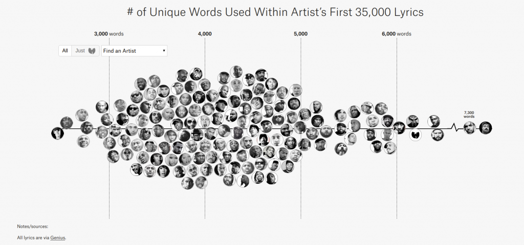
Yes! That looks like a “beeswarm” layout for the circles, for which there are plenty of examples with D3. Getting the images to display in the circles is another layer of this technique that can be readily accomplished with Web technologies. You can use Blockbuilder Search to find beeswarm examples.
Some Cool Visualizations
I’m constantly discovering mind blowing visualizations. Some of these look particularly ripe for reproduction using D3, and perfect for lecture videos.


It’s so satisfying to finally launch something like this publicly on a large scale. I’m so excited to see what happens. I hope to elevate the skills of many people and watch hundreds of new data visualizations be created!